PROEF is a dutch word with multiple meanings, to taste or to test something. The name is the embodiment of the idea behind the startup. The logo exists out of several shapes, emphasising the collaborative nature between PROEF and its participants.
To communicate better what PROEF has to offer, a set of icons was created.
They represent the benefits of the platform for both its clients and professional partners.
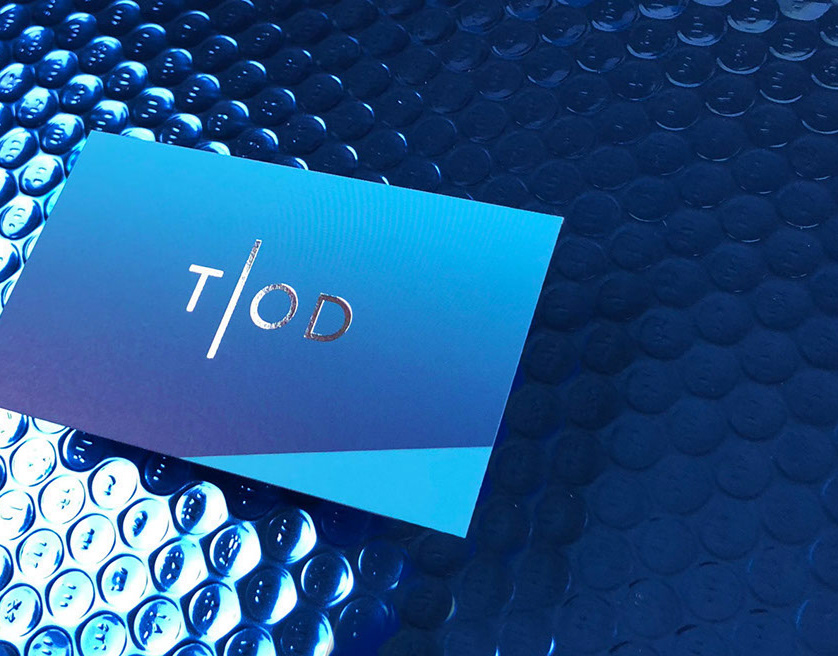
The business card has a striking blue inner seam and is extra thick (600 gsm) making it very solid.
It is uncoated and has a textured finish. The design is very clean and minimalistic.
It is uncoated and has a textured finish. The design is very clean and minimalistic.
To personalise stationery, four 38mm round stickers were designed. They will be attached to invitations and other paper documents to create brand awareness throughout the print communication.
A website was built to showcase the platform and to target potential participants.
Visit www.proef.org to get a better look.
Founder Karl Magnus talks about the mechanics behind PROEF.
He goes on to explain the concept and the many benefits of his platform.
He goes on to explain the concept and the many benefits of his platform.
